
Why Is Clear Site Navigation So Important?
Is your website simple to use? Can a visitor land on your site and easily figure out where to go next? Can they navigate through your site… and back out when they need to?
Let’s look at the ingredients that make for easy site navigation, and talk about why easy site navigation is so important.
Be Kind to Your Visitors
Before we zero in on site navigation, we need to think about the visitor experience when they land on your web site.
Consider what happens when you land on a new web site. You have to figure out how it “works”. In other words, what is the structure? How do you access the information you need, make an enquiry, ask a question, buy a product, download a free ebook and so on?
Say you land on a sales page for a particular product. Now you decide to look at more products in the same category. How do you get to that Category page? Is it obvious or do you have to figure it out?
Whenever your visitor has to stop and think what to do next, there’s a chance they’ll back right out of your site and go elsewhere.
The last thing you want to do is frustrate your site visitors. So make their life as easy as possible. A returning visitor will forgive a few of your sins, however a new site visitor most certainly won’t.
So how do you be kind to your visitors?
Keep it Simple
We’ll start with the Navigation Bar. That’s the row along the top, the one with “Home”, “About” “Contact” and so on. Or sometimes it’s down the left hand side. Never down the right side, this is reserved for promotions, testimonials and so on.
Use common terms in your Navigation Bar, such as “Home” and “About”. You might think creativity will make your web site stand out, so you replace “Home” with “It All Starts Here” and “About” with “Get To Know Us” for example.
Bad idea.
You’ve simply placed another obstacle in front of your visitors. Instead of glancing at the Navigation Bar and seeing familiar terms, they’re confronted with something else they need to figure out. Will they spend time figuring out your unique style… or back out and click onto another website? I think you already know the answer.
What About Links?
The “convention” is underlined blue text like this. Sometimes you’ll see other colours used for links, maybe orange or even bold text. However, visitors instantly recognise underlined blue text equals a link to another page.
If you decide underlined blue text is not appropriate for whatever reason, then at least be consistent. Use the same convention throughout your web site. If you decide links will be orange for example, then go through your site and change every link to orange.
Really, the case to change from underlined blue text to something else must be compelling. Why make your site visitors dig for links? I recently had an experience with a web site I often use. I wondered why they would talk about a company or a product but not have a link to that page. I only discovered they used bold text to signify a link, when I accidentally hovered over one of these links.
This is a high quality site selling premium products. On the whole, their site is excellent. It’s intuitive to navigate and the content is high quality. But those bold links… wow!
How Do I Get Home?
It’s often forgotten that many first time site visitors don’t arrive at your Home page. Their first experience of your site is more often a page other than your Home page. Just think, when you do a Google search how often are you lead to a Home page? Most of the time you’ll land on a blog post, article, sales page and so on.
On every page, you have to consider how to keep your visitors on your web site. If your site navigation is set up well, then their next move will be obvious. You can help your visitors in a few ways:
- Make sure every page has a navigation bar, located in the same place on every page.
- Maintain a consistent format for links to other pages. Clearly, my preference is for underlined blue text since it’s universally recognised as a link. Whatever you choose, be consistent throughout your website.
- Every page should have a link to another page. This serves two purposes. It helps your site visitors find related content on your site. And it helps Google understand what each particular page is about and how pages within your site relate to each other. Then Google can more accurately index the given page and show it in a Google search.
And at the end of every page, give your site visitors somewhere to go. This might be the Home page, a Contact page or a list of related articles. Never leave them hanging, give them a place to go.
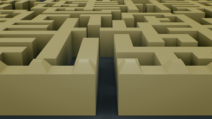
Think of a museum or an art gallery. Each room leads you carefully towards the next room. Imagine if you left a room full of ancient artefacts, turned the corner and walked straight into a brick wall. Oh, and there were no signs guiding you out of there either. You’d be confused, a little angry… and you’d probably leave, never to return. Your web site navigation is no different.
Your Takeaway
Clear and simple site navigation is crucial to the success of your web site. Combined with high quality content, you’re well on your way to creating a site that visitors will love to interact with. By taking their hands and gently guiding them through your site, they are more likely to stay on your site and return time and again.
Whatever you do, don’t let them walk into a brick wall.
If you think your site navigation could be improved, I can help you. Go here to contact me about reviewing your website.
Andrew Murray